Note: This post is best viewed on desktop.
Visualisation

Overview
I started developing this interactive resume back in February after browsing the Tableau Public Gallery. I was challenged to create something different, but something that suits me at the same time. I find the half-bubble chart to be the most difficult part of creating this viz. It took me a couple of weeks to find the right tutorial to achieve the look that I wanted.
My favourite part of this viz is the simplest graph of them all: the ‘highlights’ timeline underneath the half-bubble chart. This timeline allows me to easily identify when I’ve reached a milestone and get a quick overview by hovering on the individual dots. As you can see, 2019 was a busy year for me! Behind the scene, it was filled with hard work, long hours, remote working, and juggling between work (in Sydney) and family matters (in Bali), but I’m very grateful for all that I’ve achieved that year.
I adore this viz and I think it’s a success, although my next goal would be to create a mobile-friendly resume.
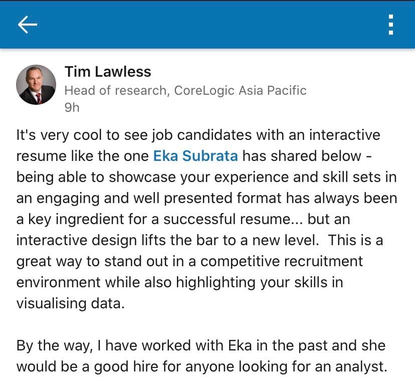
P. S. I’m absolutely thankful for the shoutout from my ex-manager on LinkedIn :)
Credits
Viz Inspirations
- Sonia Warang - Resume by Sonia Warang
- Jasna - Interactive Resume by Jasna Dishlieska Mitova
- Josh Tapley Resume by Josh Tapley
- Ann Jackson - Resume by Ann Jackson
Tutorials
- Arc Chart Tutorial by Tableau Magic
- Tableau QT: Rounded Bar Charts by Tableau Magic
Colour Scheme
- Dopely Colors #104 by @/mr.pugo on Instagram