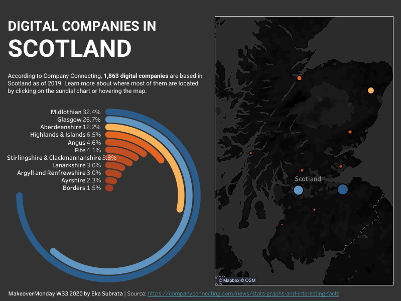
MakeoverMonday Week 33 2020 - Digital Companies in Scotland
I thought radial bar charts look interesting and is suitable for this visualisation, so I gave it a try. I used the tutorial from Tableau Magic.
Data is sourced from here.
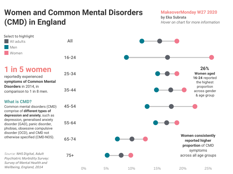
MakeoverMonday Week 27 2020 - Common Mental Disorders (CMD) in England
Visualisation
I created two visualisations for this week’s data because as a young woman, I believe it’s important to highlight the issues faced by the people who are just like me.
Overview
Mental healt...
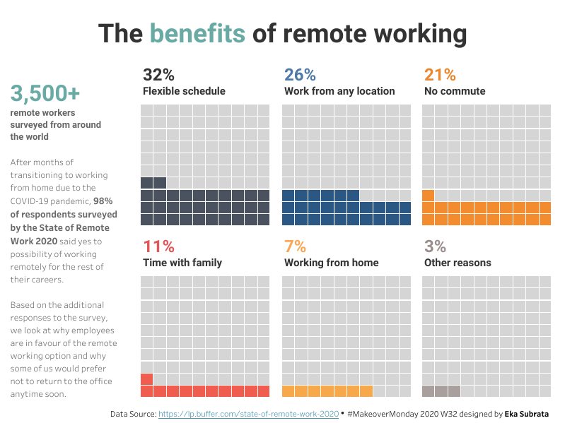
MakeoverMonday Week 32 2020 - The Benefits of Remote Working
Visualisation
I’ve been wanting to use waffle charts for one of my Makeover Monday viz for a while and I finally found a good example to replicate from the inspiration viz below :)
Data Source and Inspiration
Data Source
Survival Rates of Reproductive Canc...
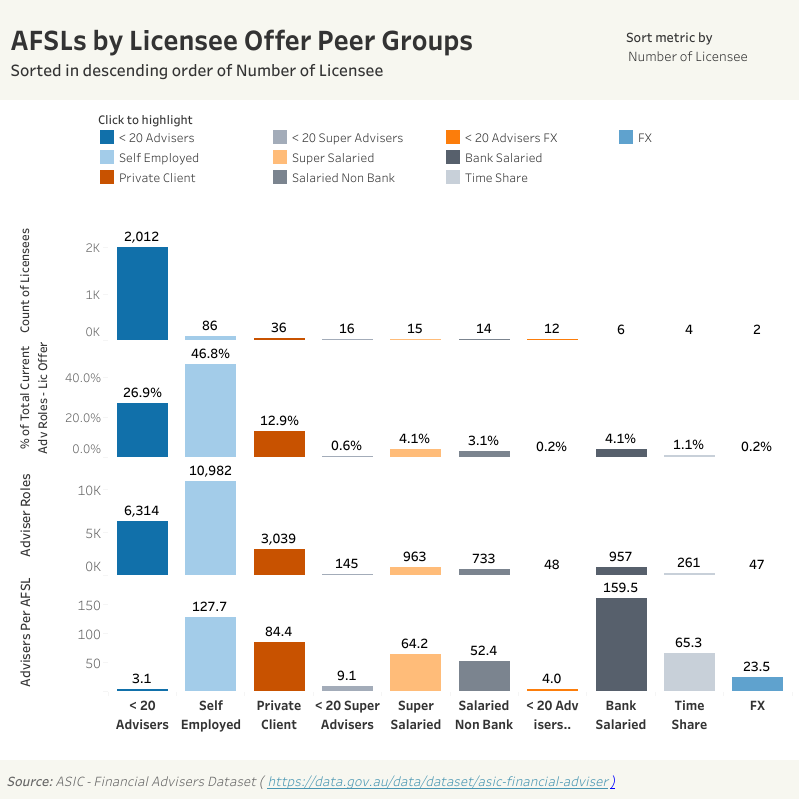
Financial Adviser Dashboard (April 2020)
This dashboard focuses on tracking the movements (appointments and resignations) of Australian financial advisers, up to April 2020. Someone I know from my previous company created this dashboard for his website and asked for my feedback. I challenged myself to give it a makeover within 24 hours and this is what I’ve done so far.
Data Source: F...
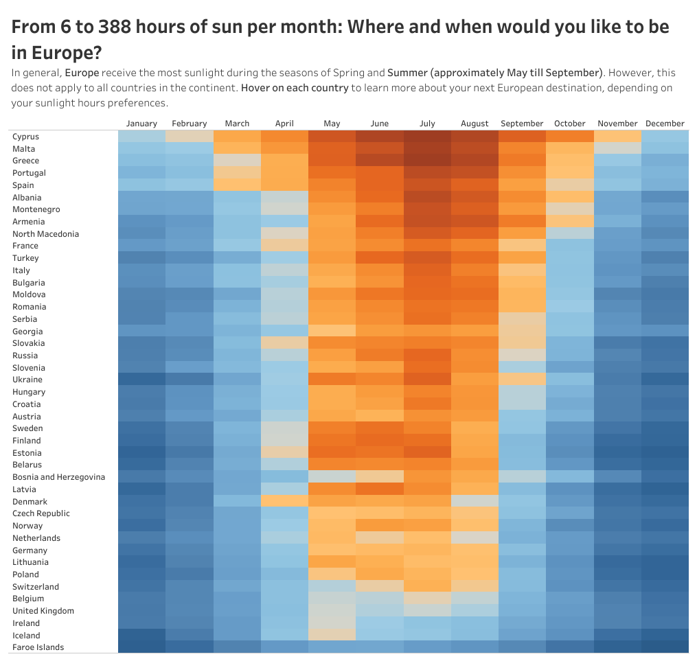
MakeoverMonday Week 44 2019 - Where and when would you like to be in Europe?
As someone who lives in Bali and gets approximately 172 to 261 hours of sunlight per month throughout the year, I think I’d like to visit a few European countries between October and April for a change!
I’ve decided to use heatmaps because it can easily visualise the difference in the average number of sunlight hours per month across European c...
14 post articles, 3 pages.